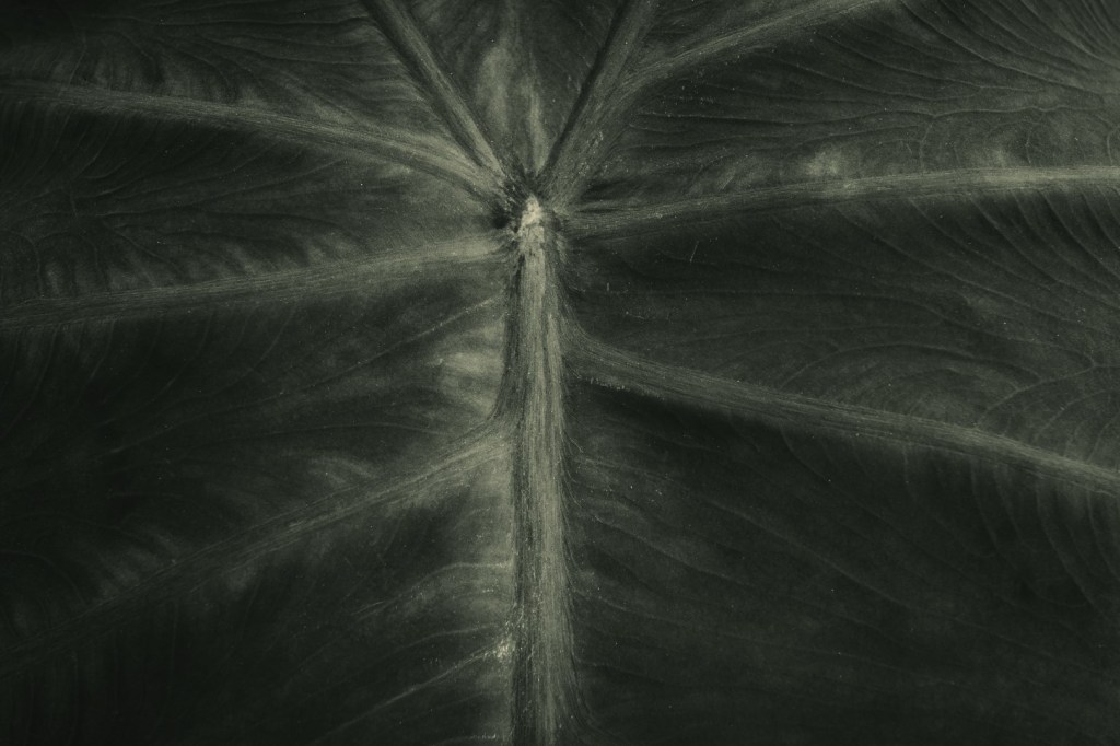
I am a big fan of black and white photography. Even though I no longer use film, I still like to “process” a number of my images into black and white. As a teenager I had a darkroom and shot and processed black and white film almost exclusively. Sure, Kodachrome was another favorite, but with black and white I had control over the whole process. I could easily experiment and learn new things.
The one thing I didn’t experiment with in the darkroom was toning my black and white prints. It was always straight up b&w. I think the reasoning was that I never really saw toned prints beyond the occasional sepia. There was no YouTube back in the day so everything had to be learned through books, magazines, or other people. How to tone prints was never anything I came across or even thought about. It was only in the modern era with Photoshop, Lightroom, and assorted plugins that I realized a monochrome image doesn’t have to be all about shades of gray.
Some purist insist that black and white images have to be black and white. Pretty petty, in my opinion, in this day and age. Try to add a toned image to a Flickr “monochrome” group and there is a good chance you’ll get rejected, or, in my case, banned from the group. Yes, I have been banned from Flickr groups because some of my black and white images had a slight warm tone to them. I’m talking real slight. Whatever.
Even though I do process a majority of my work in traditional monochrome I do on occasion fell like some images need something extra. In some cases, depending on the subject, I may choose a slight warmer tone which seems to set the feel for the image. I usually use warmth in my nature and antiquities (old item details, dilapidated barns, etc.) subjects. Though I rarely go for a cooler tone I am not against it. To me a cooler tone works best with “hard” subjects, like urban architecture. That’s usually it. When I do see toned monochromes they are usually just that – slightly warmer or cooler. But what about green?
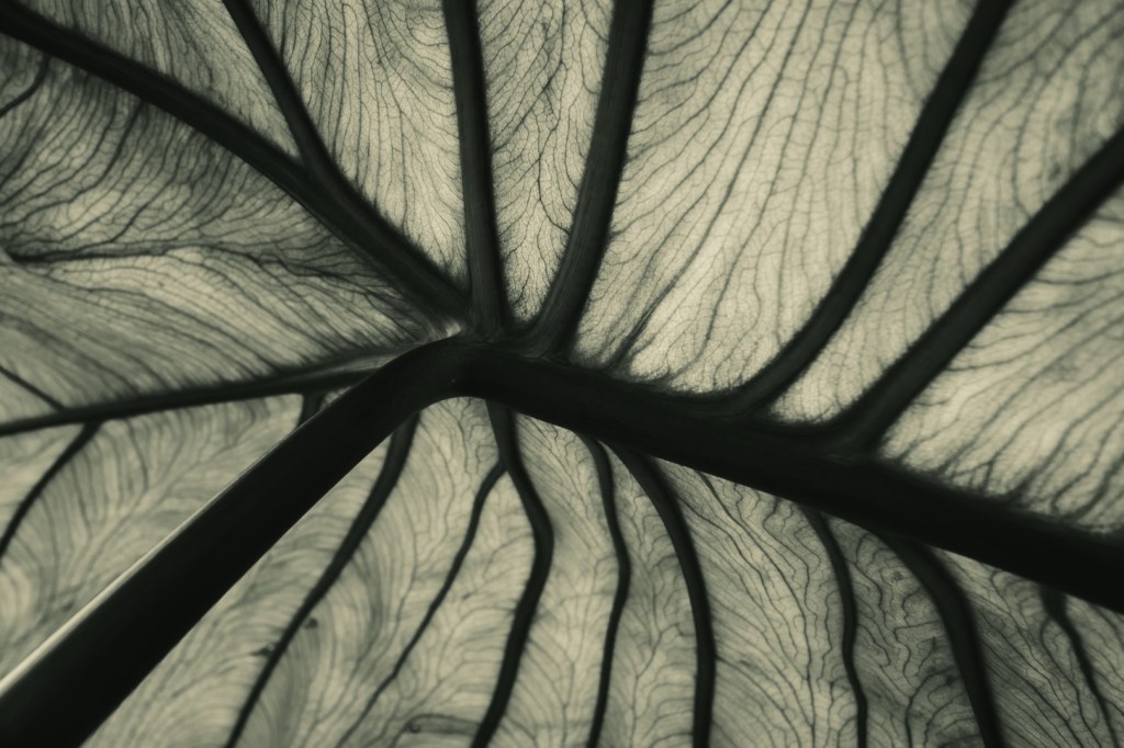
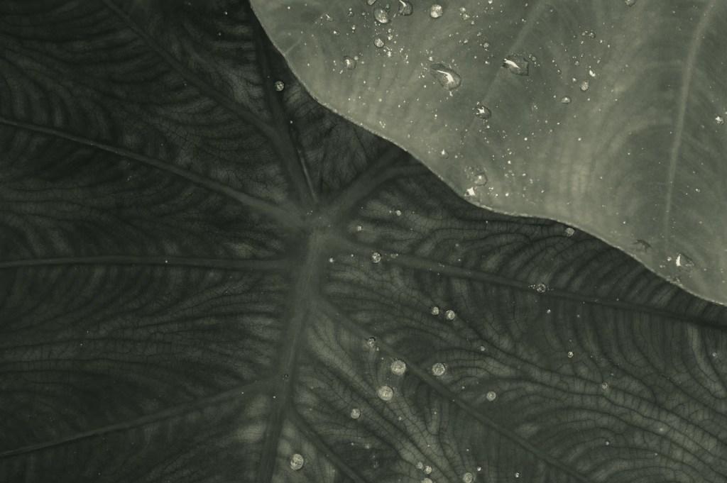
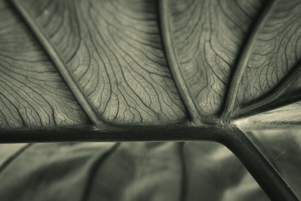
I don’t know if a greenish cast has any connection to traditional darkroom or not. Traditional toners to stabilize prints added warmth or coolness, and those processes carried over to digital. If anyone knows, please let me know. It may very well be a digital thing and I’m fine with that. Regardless, as I mentioned in previous posts, I am shooting a lot of my nature work for black and white. Though most of my b&w nature work is straightforward, I drifted towards this greenish tone on some recent leaf study photos. I tried going in other directions with the processing but I kept coming back to this tone. I think it works great for the subject matter. I’m guessing it wouldn’t look very nice for portraits though!
