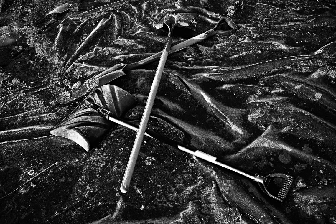
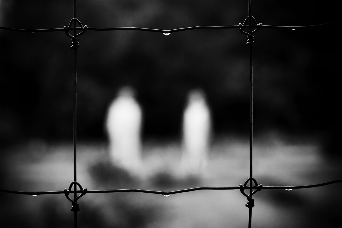
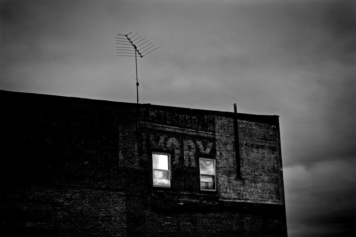
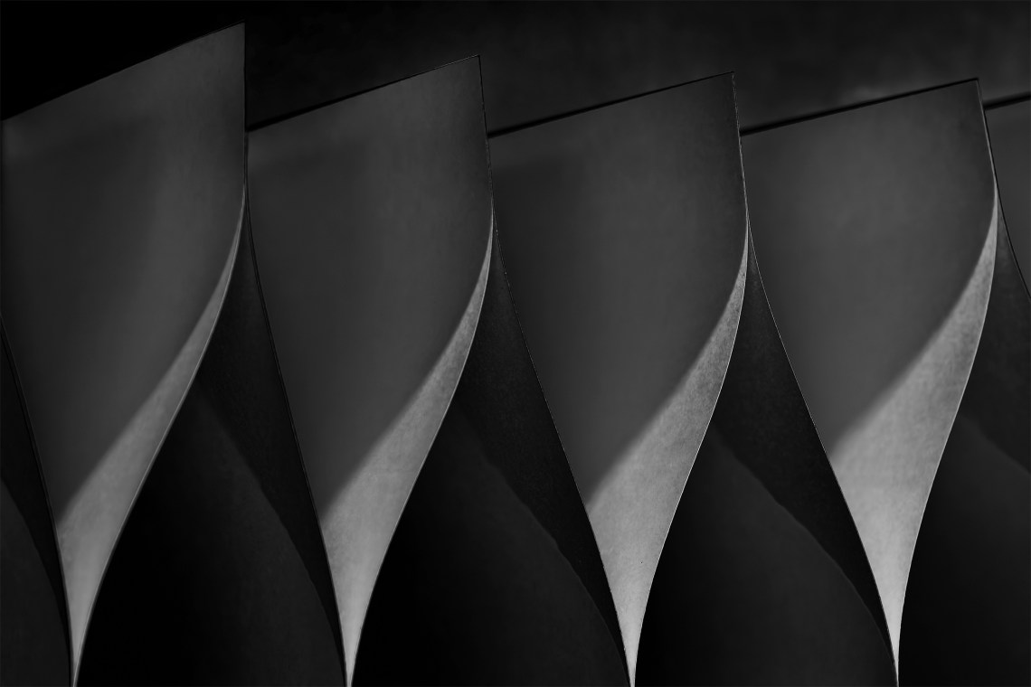
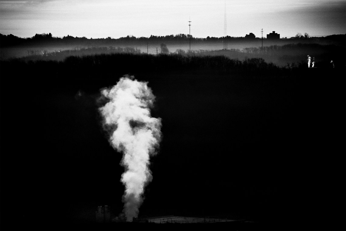
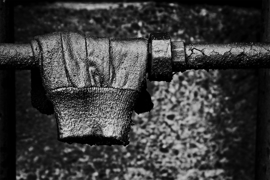
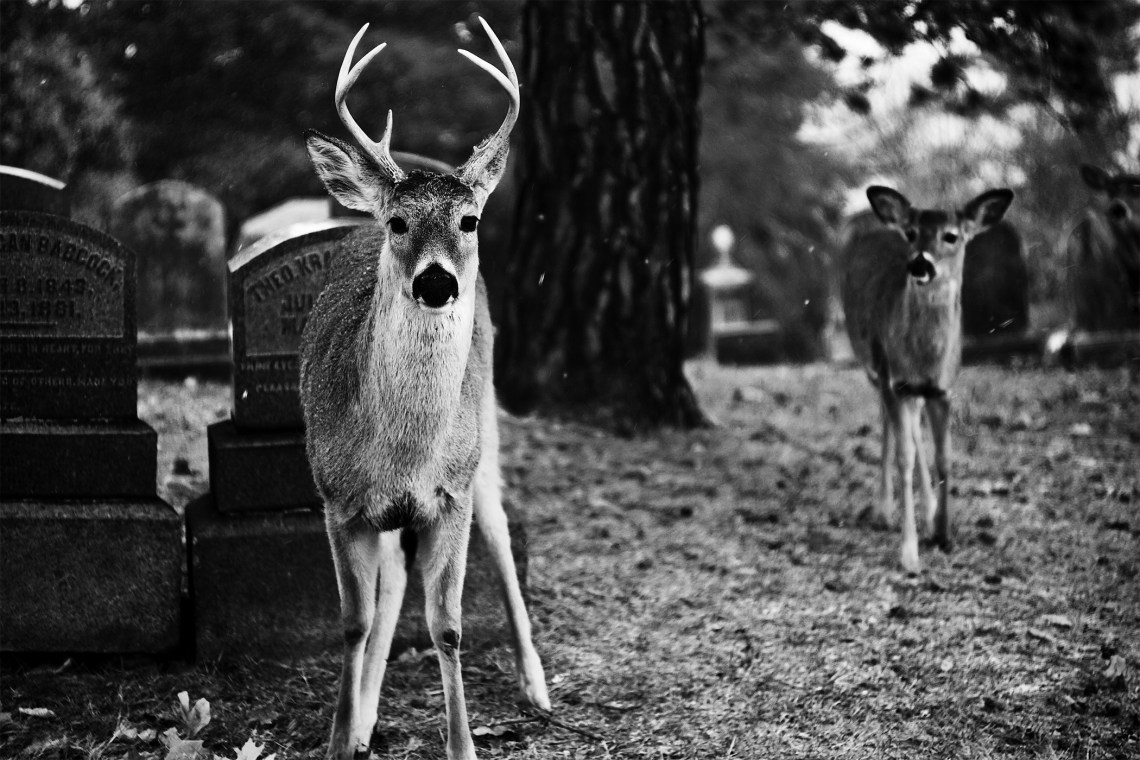
I’m going to enter some photos in a competition for black and white images. There is no specific category that I have to submit to (the judges will decide) with the only criteria being technical, that the images are a certain size and B&W in grayscale mode. The photos generally fall into the fine art realm with an emphasis on, from what I’ve seen on past winners, individuality, experimentation and generally darker tones. Weird is not unheard of. So, I would appreciate some feed back on which I should enter, keeping in mind on how the photo stands as a strong B&W image – one that would make you stop if you saw it in a gallery. I’ll probably enter multiple images but, since I have to pay for each image entered, I would like to keep it to four or less. Thanks!
#1
#2
#3
#4
#5
#6
#7
#8
#9
#10
#11
#12

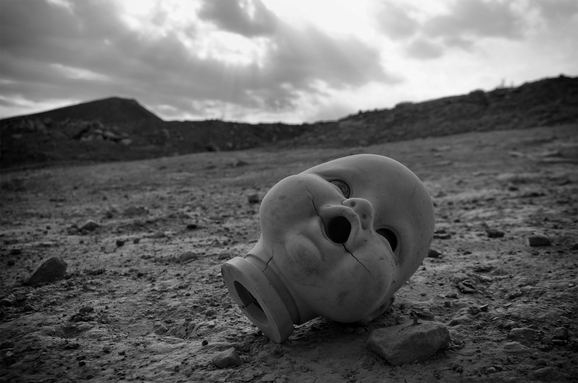

#4 is a gallery contender
Thanks Chuck. It was a favorite when it appeared on my 365 project last year.
I am lost !! So many wonderful photographs! 4th is hands down favourite. 2nd one too. 6th one,deer one!
Thanks Sonali. #4 is always a favorite, especially with co-workers. Creepy / weird is always a hit in the fine art world!
Very difficult to choose…. I was once told ( by competition judges) that my most successful images were those that showed more of my personality rather than photographs that anyone could have taken.. .. 2 – is very evocative and clever.. I can see why people like 4 but personally not my cup of tea and I find the slanting horizon offputting.. I have been drawn back to No 7 several times.. and I like the shadows in 11
Lookiong at what you’ve written again about which would make me stop and look in a gallery..actually No 1 would It has very good depth of field and 4 ( but with straighter horizon) , 7 and 11
Thanks Helen. Others have mentioned the slanting horizon in #4 in the past and the first thing I did when processing the image was to straighten the horizon but it just seemed to lose its impact, at least to me. I went back and forth a couple of times but decided to stick with the tilt – more nightmarish maybe. There’s something about #7 that I like also – I think the texture and tones.
Good luck with them and let us know.. That first one is like a painting.. the more I look at it the more I like it….. as for the dolls head.. did you try tilting it even more ??
Thanks, it will be a few months before I know anything but I’ll be sure to post about it. I’m drawn to #1 also. It makes me want to stare at it for a while. As for the doll photo, no I didn’t try to tilt it more, I may try it later and see if it works. I understand what you are saying – it’s tilted just enough to look like sloppy camera work but not enough to look intentional.
they are lovely;
#2 definitely
#3 – love that composition
#8
#12 – those leading lines are so strong, awesome photo
Thank you Chloe. It’s tough narrowing them down and you hit on a few that I like also.
#8 for me. I would love to see the image printed – very black
Thanks for the input. Very much appreciated.
#2 is a wonderful capture! That would be my choice.
Thanks. I’m keen on that one also.
I like #’s 1, 5, & 7. good luck!
Thanks!
#2 jumped out at me.
Thanks. It seems to be one of the finalists.
2, 4, 5 or 7 🙂
Thank you Tanitha.
#2 for the juxtaposition or suggestion of “keep out”–it is a graveyard, right? And #7–because it tells a story. Good luck!
Thanks. #2 is actually the “chicken people” scarecrows that I had in previous photos. #7 proved more popular than I thought. I liked it, so I figured no one else would 🙂