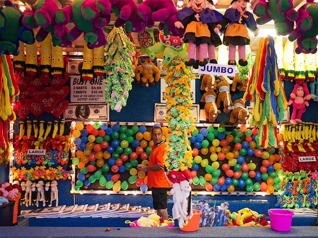
I imagine you would go through a whole box of crayons if you were to color in this scene. This is a grab shot from the local fair and although it doesn’t have a whole lot to offer as far as composition it certainly makes up for it in the amount of color! I probably should have toned down the saturation a bit to make it easier on the eyes but a little pop once in a while doesn’t hurt that bad. 😉 This one is straightforward processing but I pushed the processing a little more on a version that I posted on Fickr using Topaz and an orton effect.


I likeit. You have to look hard to spot the chap in the Orange top.
Thank you Robin. Yes, he does blend in well.
I agree with lightweight–the guy blends in with all that color! Great photo, David.
Thanks. I’m not sure about this guy but judging by the amount of “shady” characters there, blending in is probably a good thing.