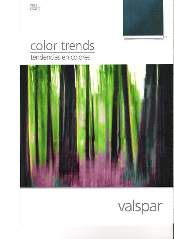
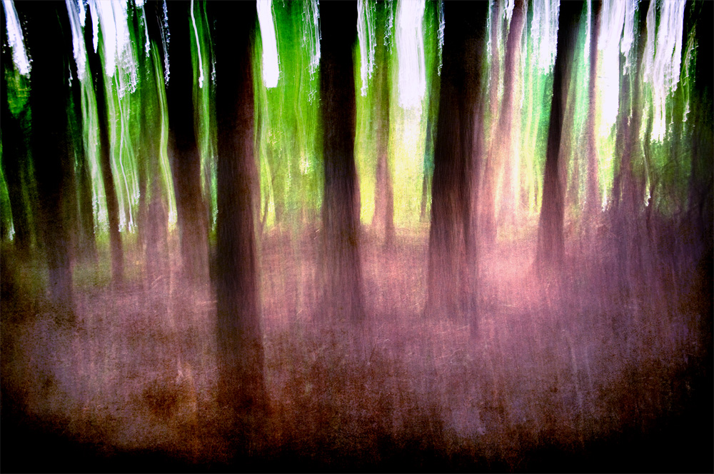
As I previously mentioned, I am redecorating some rooms in my house. After almost completing the dirty work of repairing the plaster walls and applying texture I went to purchase paint at Lowes yesterday. I already had a color picked out but as I was looking at the paint color palette brochures, I was surprised by the cover image on one of the brochures as it looked amazingly like a photo I took last August and featured in my 365-236 post. Now I know it’s not the same image, as the brochure is dated 2010, and those moving camera pictures of trees can look very similar but I was struck by how close the colors and textures were.
Here is the brochure:
And here is my image:


You aren’t kidding! Those are very eerily similar!
You can see why I literally stoppped in my tracks when I saw it.
Wow – that is quite a “coincidence”! Curious about the 2010 date on the brochure – maybe a copyright for the text and the photo was added in 2011? If your photo was not the inspiration for this, it is truly an amazing coincidence. But I think your beautiful photo was the inspiration!
Thanks Karen (and thanks for the spelling correction – I didn’t even notice, it seems like my fingers type letters by themselves). You could be right about the brochure. I’ve never seen it before but then again I haven’t looked for paint in a while. I just think it’s strange that they would use that type of image on a paint brochure.