
© David Guidas
If there is one thing that I struggle with when processing photos, it’s the contrast levels. I almost always add some contrast to most of my photo. Processing from RAW files that is almost inevitable, but where to stop is the hard part. Contrast is subjective and what looks good during processing may not translate well later.
My monitor screen and the lighting in the room could cause my eyes to compensate. What looks good at the time may not look good under different circumstances (another computer, different environment, etc.). But I can’t control how my photos are viewed by myself or anyone else, so it, like most things, is always a compromise.
The biggest problem I have is wanting to go overboard. I tend to think more is better, trying to emulate looking at a backlit 35mm slide, I imagine. It’s only when I pause, take a moment to look at the photo, breath, evaluate, and then really think about what works best for the image do I finally set what I think is the best contrast level for the image. The lighting, subject, and mood I want to convey are the deciding factors – not me.
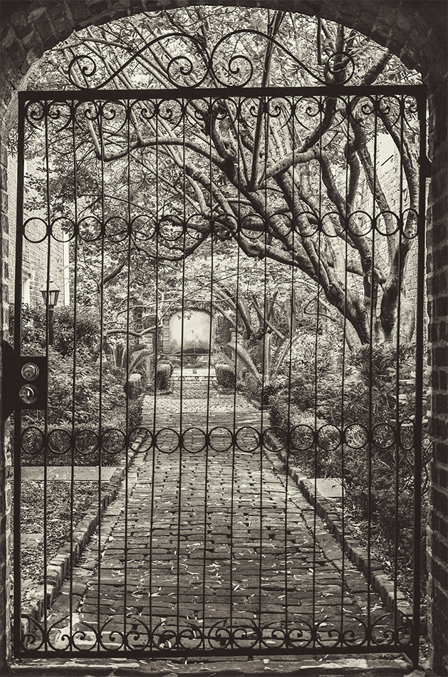
I’ve processed this image in multiple ways, both in color and black and white and I always tried to veer away from too much contrast. It looks nice no matter what I do but I thought I would try to process it in a platinum print B&W style. Platinum prints are generally low contrast but the results have a unique look with a wide tonal range. Obviously the digital emulation isn’t near what a true platinum print would look like but it’s always fun to try different looks for some images.

That’s a lovely image. I think you have the contrast spot on – at least on my screen.
Thanks Robin. I had to kick it up just a notch to get the black gate correct, which I used for my visual reference.
I think you got it spot on. For me, it’s that softer contrast of the trees in the background that is really appealing, especially when set against the striking dark shape of the gate. Really nice.
That is a beautiful picture, captured my attention right away as I was scrolling through the Reader.
Thank you.