
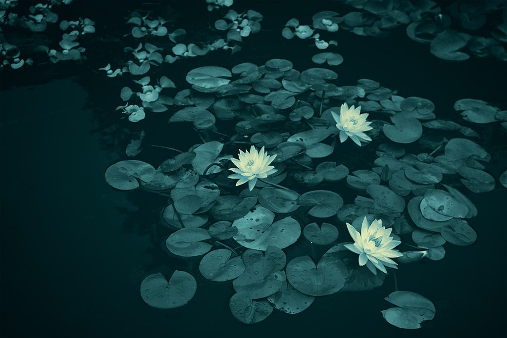
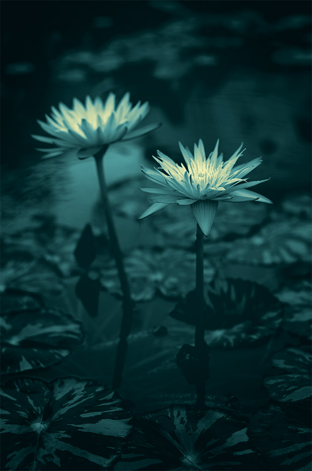
I made my annual visit to shoot some water lilies at the pond outside of Phipps Conservatory, since they look their best this time of year. Although I try to challenge myself to be more creative each time, I am usually quite happy with the straightforward color shots. The flowers are pretty and colorful and the lily pads and reflections always make for nice backdrops. The lighting was good yesterday as it was cloudy and overcast which was like a large soft lightbox over the whole pond. Getting interesting compositions is the toughest part because of the location. The pond is right next to a building which I don’t always want reflected in the water and I can’t always get close enough to certain flowers. There are also identifying signs near some of the plants that I try to work around.
All that being said, this years outing was satisfactory but I wondered what I could do different in the processing department. I saw that the contrast of the flowers top the background was high enough to make for interesting black and white images. After I started that process I wondered almost immediately what a toned monochrome image would look like. When I hit on the teal tone, I knew right away that was what I was after. The flowers practically jump out of the photos due to the contrast. They seem to almost glow against the dark water.
Now, what am I going to do next year?
© David Guidas

© David Guidas
© David Guidas
